Featured Work
Brand Creation, Brand Touchpoints, Brand Revitalization
Merger Leads to Rebrand
For Earth, From Space
WOODS HOLE GROUP is an international environmental consulting organization specializing in energy & mining, environmental monitoring, and sustainable fisheries management. Upon merging with two companies – CLS America and Horizon Marine – they reached out to Carol McLeod Design to rebrand the company.
We designed the new brand identity to focus on the group and its expanded strategic offerings. Extracting the essence from each entity (circular-shaped icons and colors), became the basis for the new brand identity: space red for CLS America, ocean blue for Horizon Marine, and coastal green for Woods Hole Group. The brand mark merges these circular shapes into a grouping that ultimately forms an abstract earth with orbiting satellite, while creating a fluid “g” that emphasizes “group.” The new brand identity conveys global reach and agility, and supports the group’s mission: to sustainably manage the earth’s resources from space.
Brand Identity , Brand Guidelines , Image Development & Illustration , Stationery & Business Forms , Marketing & Sales Collateral , Presentations , Web Modal
View Project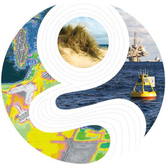
Creating a Fresh New Brand
Cape Cod's Finest Salsa
MY FATHAH’S began in the owner's vegetable garden and kitchen. Uniquely using fresh grape tomatoes and vegetables, the owner and his father created a delicious, flavorful salsa. But, it’s more than a great salsa recipe – it comes from the love of family and cooking and their desire to create a healthy, fresh and fun food for their family and friends.
My Fathah's partnered with Carol McLeod Design to create their brand personality from the logo to its packaging and website. The logo's iconic "F" isn't just for "Fathah." It stands for all the fresh ingredients that their products contain. We illustrated the primary vegetable ingredients of their flagship product and used fonts to help convey the bold flavor as well as the warmth and friendliness of the makers themselves.
The brand is already off and running having won "Cape Cod's Finest Salsa" two years in a row. The company continues to distribute its goods at Farmer's Markets and is now available at several local shops. With the new e-commerce website, they are now able to sell to customers and wholesalers online.
Brand Identity , Image Development & Illustration , Packaging , Website Design & User Interface , Marketing & Sales Collateral
View Project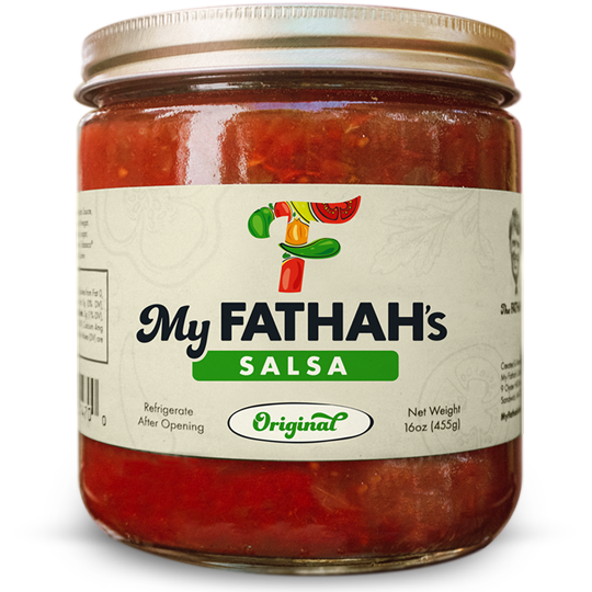
Appealing to the Global Market
Engineered Yarns. Smart Solutions.
EY TECHNOLOGIES is a custom-engineering group providing creative answers to the industrial yarn requirements for electrical equipment, paper machine clothing, transportation, telecommunications, and composite industries.
CMD was first introduced to EY Technologies when they needed to design an exhibit booth. Soon thereafter, we began to discuss their brand strategy – their desire to appeal to a global market, specifically the Asia/Pacific region. They had developed an R&D department and also wanted to convey their innovative and forward thinking approach to solving their customers' needs. This lead to a revolutionary redesign of their company logo along with a new tagline. The modernized "EY" reflects the energy of fibers winding on spools.
Brand Strategy , Brand Identity , Tagline Creation , Stationery & Business Forms , Copy Writing , Image Development & Illustration , Website Design & User Interface , Marketing & Sales Collateral , Exhibit Graphics
View Project
Unifying the Brand Experience
Intelligent Marine Robots You Can Rely On
HYDROID is a field-proven technology leader in advanced marine robotics, specifically autonomous underwater vehicles (AUVs). The company designs and manufactures state-of-the-art solutions for defense, marine research, and commercial applications. Located in the U.S.A., Hydroid is a subsidiary of Kongsberg Maritime, the world’s most trusted manufacturer of AUVs.
When Hydroid needed to differentiate themselves from the growing competition, they turned to Carol McLeod Design to rebrand the company and its products as well as to unify its brand experience across all of its customer touch points. The company's brand personality is based on one of the common physical aspect of its products – the red fin.
Brand Identity , Product Logos , Website Design & Development , Marketing & Sales Collateral , Image Development & Illustration , Videos & Animations , Advertising , Stationery & Business Forms , Presentations , Email Marketing Templates , Exhibit Graphics , Tradeshow Booths & Banners , Signage & Wayfinding , Workplace Branding
View Project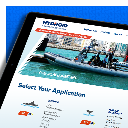
Streamlining Online Ordering
Your Hometown Store
TRUCCHI'S opened their first store in 1928 in Taunton, MA. Since then, they have added five more stores, but retain their hometown pride, continue to provide high quality foods and deliver quality customer service, and treat their customers, employees and suppliers like family, friends and neighbors.
We modernized their website to deliver a brand experience consistent with their values. The site was custom designed and built on a responsive CMS platform that enabled them to tell their story while drastically improving their "Entertaining Made Easy" online ordering program. The e-commerce system also allowed them to sell Gift Cards and merchandise online. We integrated a customer-friendly Weekly Circular, a blog-style Recipes section and a mapping tool for easy access to store locations and directions.
Web , Website Design & User Interface
View Project
Launching a New Tech Brand
Detect. Communicate. Adapt.
JPANALYTICS develops underwater acoustic technology for communications and detection systems for defense and commercial applications, ranging from complete hardware packages to software solutions. They also provide systems and algorithm development support to their partner-owned products. With the right combination of advanced research and first principles engineering, their robust acoustic systems redefine the performance boundaries in complex ocean environments.
JPAnalytics approached Carol McLeod Design to create the brand personality for its start-up technology firm. Since the company’s technology is often used for clandestine operations, an abstract approach was chosen to convey the company's acronym. The right combination of long and short dashes visually reveals the letters “J,” “P” and “A.”
Brand Strategy , Brand Identity , Tagline Creation , Brand Standards , Stationery & Business Forms , Website Design & User Interface , Marketing & Sales Collateral , Exhibit Graphics
View Project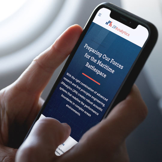
Supporting Growth
Connecting People. Driving Events.
CONVENTION DATA SERVICES provides event registration, business intelligence, and lead management partner servicing to top show organizers worldwide representing major events in the high-tech, energy, manufacturing, medical, healthcare, hospitality, communications, insurance, and transportation industries.
Convention Data Services has engaged Carol McLeod Design to work on a variety of projects including rebranding the company to align their image with the quality of the services they provide, enhancing common areas within their new headquarters, and launching new products.
Brand Identity , Product Logos , Videos & Animations , Signage & Wayfinding , Workplace Branding
View Project