Print & Environments
Reflecting Culture and Values
A Proud History. A Limitless Future.
HYDROID is a field-proven technology leader in advanced marine robotics, specifically autonomous underwater vehicles (AUVs). The company designs and manufactures state-of-the-art solutions for defense, marine research, and commercial applications. Located in the U.S.A., Hydroid is a subsidiary of Kongsberg Maritime, the world’s most trusted manufacturer of AUVs.
Upon the construction of two new buildings on the Hydroid campus, Carol McLeod Design carried the new brand personality into the workplace – reflecting Hydroid's culture and values. Our goal was to create a comforting environment, reinstate a strong sense of pride in the company, boost employee motivation and productivity, and display prestige and professionalism to potential customers. We carried the fin-shaped theme throughout the interior as framework to highlight the history and many successes of Hydroid.
View complete branding project for Hydroid.
Workplace Branding
View Project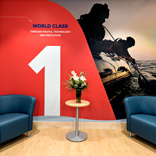
Multi-Product, Multi-User Campaign
The Simple Choice for Water Quality
WATTS Water Quality Division provides solutions designed to facilitate the preservation, testing, treatment, and filtration of water because every drop counts. Their complete water quality and rainwater harvesting solutions offer everything needed to conserve and deliver the best water possible.
Watts asked Carol McLeod Design to develop a campaign that would educate water quality dealers in the United States and Puerto Rico about the six different water filtration technologies that Watts offers for a variety of water conditions, as well as position Watts as a leader in improving comfort, safety, and quality of life for people around the world. The products' ease-of-use and comprehensive solutions ultimately led us to develop a theme based on "simplicity," which we supported by creating a campaign tagline – The Simple Choice for Water Quality. All headlines are comprised of two words, each beginning with "Simply" paired with the end result that the respective product would deliver. A custom-illustrated set of icons further re-enforces the theme and helps to visually distinguish one product from another.
Tagline Creation , Copy Writing , Icon Illustration , Marketing & Sales Collateral , Direct Mail
View Project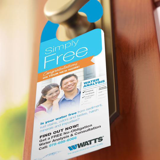
Launching a Capital Campaign
For Future Generations
FALMOUTH JEWISH CONGREGATION consists of members that represent varied traditions, practices, and beliefs. However, they are united in their dedication to providing a place that meets the needs of the Jewish community for worship, lifelong learning, and charitable acts. Following their mission and based on the need for the Falmouth Jewish Congregation to secure the legacy for future generations, the endowment campaign was formed.
We began by refining the typography and juxtaposition of the organization's existing logo elements. The new, contemporary treatment was introduced in an effort to bring the older and younger generations closer together. The stained glass star – which came from the window in its Synagogue – was the primary graphic element used for the endowment campaign materials. The campaign included a member appeal letterhead along with a kit-style brochure that had an oversized pocket to contain an overview sheet, frequently asked questions, and pledge card. Candid photography generated by the Falmouth Jewish Congregation was placed into the stained-glass shapes on the brochure's outside and inside covers to convey a friendly organization that embraces diversity. With narrower interior pages, photos of younger and older members together all remained visible no matter what page you were reading, helping to envelope the organization's history, challenges, and vision for the future. These materials helped to reshape the organization’s brand and reinforce the need to secure their legacy for future generations.
Brand Identity , Stationery , Endowment Brochure , Overview Sheet , FAQ Sheet , Pledge Card
View Project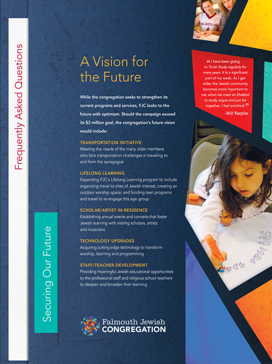
Increasing Sales Via Targeted Mailer
Our Skill. Your Luck.
SPINAL TECHNOLOGY is a leader in providing orthotists with highly effective, custom fabricated spinal orthoses across the United States and Europe for patients requiring stabilization, immobilization, and correction of the spine.
We designed and produced this unique campaign as a way for Spinal Technology to increase sales from customers within specific market areas. Our theme matches their skill set and quality with that of a blacksmith, who historically would make back braces in the 1800s. Given that the horseshoe is a sign of luck, the recipients received a special offer. Each genuine horseshoe – engraved with the company's web address – was mailed in a metal tin and sealed with a mailing label entitled "Our skill. Your luck." The shiny, heavy-weight aspect of the piece also helped increase the open rate.
Copy Writing , Direct Mailer Packaging
View Project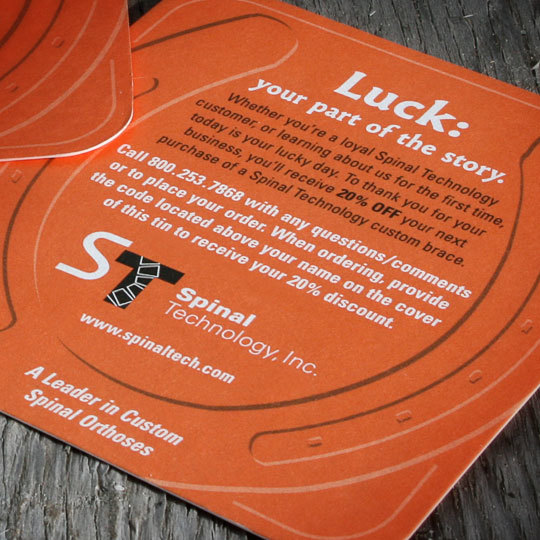
Creating a Powerful Yet Flexible Presentation
Focused on Sustainability
INTEGRATA ARCHITECTURE + CONSTRUCTION provides client-specific architectural designs that integrate multiple building systems to maximize efficiency, functionality, and aesthetics. Unlike other architecture firms, they also provide construction management services, which enables them to ensure proper execution of their design plans during the building process.
Integrata already had a brand identity and simply wanted to improve their existing website. The logo was clean and modern, but the existing website was antiquated and hard for visitors to navigate and Integrata to update. Through an assessment of their current materials along with a strategic MindMerge session facilitated by Carol McLeod Design, we discovered a gap in communication and an inconsistent brand experience. So, we created a personality for Integrata that aligned with their business goals and their vision for the future. We brought consistency to their existing materials and designed new advertising and communication materials to effectively reach and engage their target audience groups – an overview brochure, a marketing/sales kit folder, and a capabilities brochure with a post binding to enable Integrata to tailor their presentations to a variety of client types. Oh, and we redesigned their website!
Brand Development , Copy Writing , Stationery & Business Forms , Company Overview Brochure , Market/Sales Kit Presentation Folder , Capabilities Brochure , Website Design & User Interface , Print Ads
View Project
Expressing the Benefits Succinctly
Snap. Swivel. Safe.
DORMONT is a leading inventor and manufacturer of safe, high-quality stainless steel gas connectors, earning the reputation as one of the foremost experts in the food service industry for over 40 years.
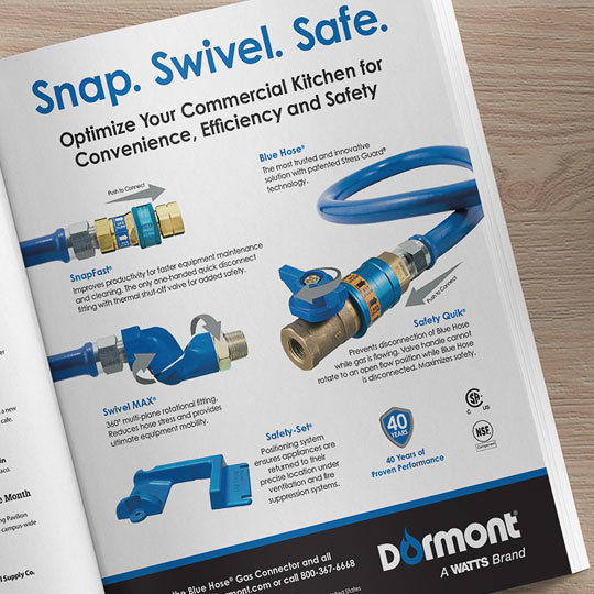
Carol McLeod Design was introduced to Dormont – a Watts Brand – to create an ad campaign geared toward the commercial kitchen industry to help promote the convenience, efficiency, and safety that their patented Blue Hose® gas connector products provide. We focused the messaging on the key benefit of each fitting – Snap for SnapFast®; Swivel for SwivelMAX®; and Safe for Saftey Quik® and Safety-Set®. We produced both full and half page ads to give Dormont flexibility with their advertising program and budget.
Copy Writing , Print Advertising
View Project