Identity & Branding
Branding & Rebranding
Logos
Corporations, non-profits, developments, landmarks, products, programs, events and even individuals all have a need to express their unique qualities through their identity. Identities are the visual translation of the names of these entities and can be wordmarks, letterforms, pictorial marks, abstract marks, emblems and characters – all symbols that give insight to the organization, trigger recall, and compete for recognition. From naming to identity, a brand is born and a personality comes to life.
Since 1991, we have created more than 125 identities for a variety of industries and clients, each designed specifically to express each client's individuality.
View Project

Branding Cape Cod's First Brewery
A Vacation in Every Pint
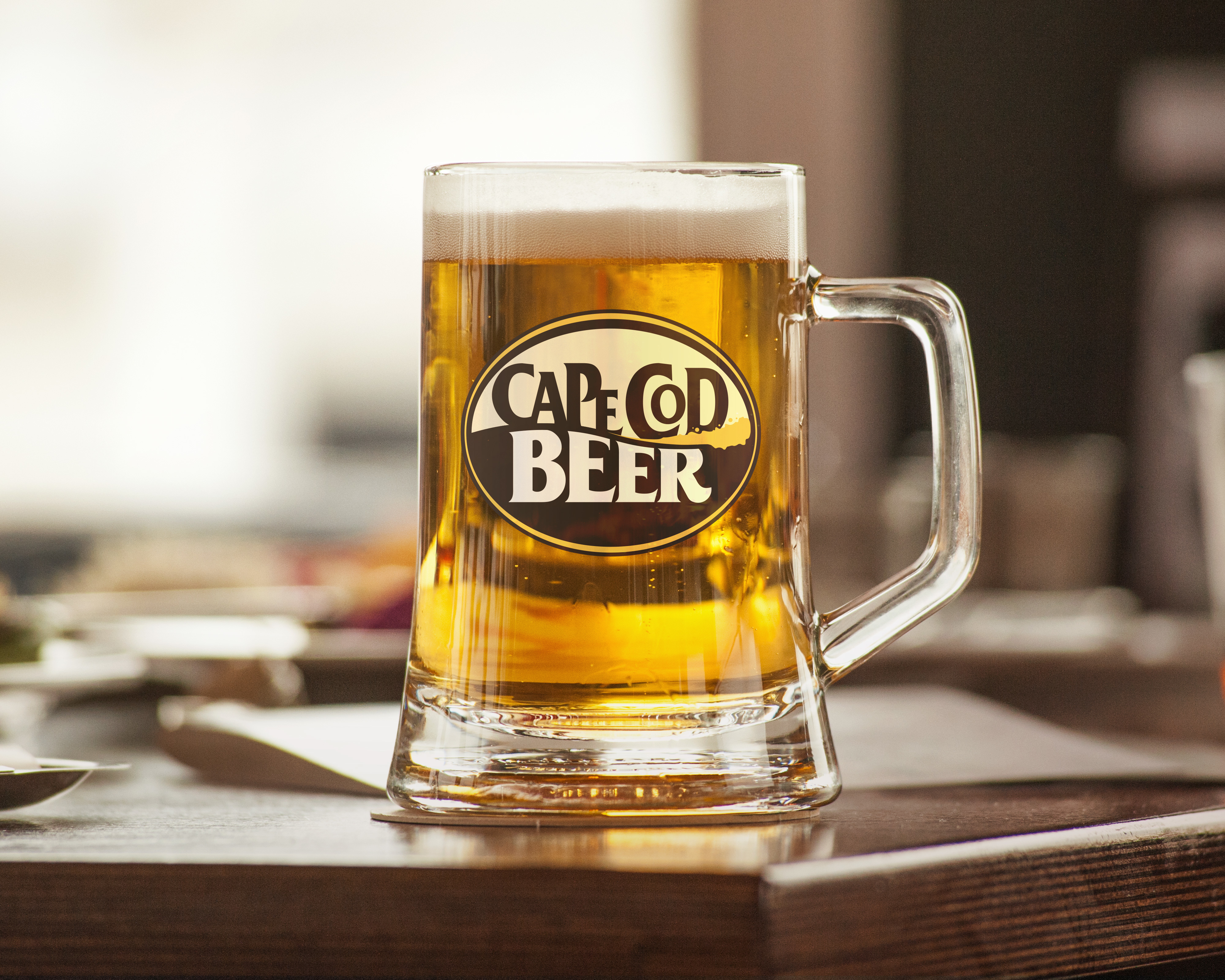
CAPE COD BEER was the first brewery to start up on Cape Cod. They sought a strong, recognizable packaging emblem that would stand the test of time, and it has.
Carol McLeod Design worked with Cape Cod Beer to design a logo utilizing typography that represents their friendly spirit, and a graphic wave element that conveys the beer's flowing, frothy and tasty qualities as well as its seaside location.
Brand Identity , Product Identity , Tap Handles , Stationery
View Project
Rebranding for Industry Change
Always Open
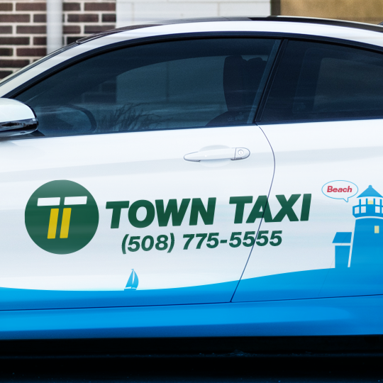
TOWN TAXI OF CAPE COD has been serving the Cape's transportation and delivery needs since 1974 with reliable, professional drivers 24/7. When ridesharing companies emerged touting services that arrange one-time shared rides on very short notice, often via a mobile app, Town Taxi turned to Carol McLeod Design to rebrand themselves in an effort to maintain its foothold in the community and its perception as a more dependable and safe service.
Our approach to the rebrand was revolutionary in that we departed from the existing illustrated cartoon image of a taxi to a more sophisticated yet easily recognizable letterform. We merged two "Ts" – one for Town and one for Taxi – whereby the unity produced a double line. Colorizing this double line as yellow referenced the symbolic road marking that signifies a virtual "wall" to drivers – a no-passing zone – that reinforces the protective, trustworthy nature that Town Taxi drivers provide to their customers.
Brand Identity , Website Design & User Interface , Stationery , Vehicle Graphics , Icon Illustration
View Project
Branding a Start-Up
Shape Your Mind for Life
KIM WELLNESS COACHING helps individuals develop positive habits to sustain a happier and healthier lifestyle through personalized coaching and online nutrition training programs.
The owner asked Carol McLeod Design to develop the brand for her start-up company. A brand strategy session followed by naming and tagline development led to a simple brand identity by melding the "m" in Kim and the "w" in Wellness to form a stylized electrocardiogram, which paired well with a clean typeface for the company name.
Brand Strategy , Naming , Tagline Creation , Brand Identity , Stationery & Business Forms , Website Design & User Interface , Marketing & Sales Collateral , Email Marketing Templates , Icon Illustration
View Project
Improving Brand Awareness
Making Our Future
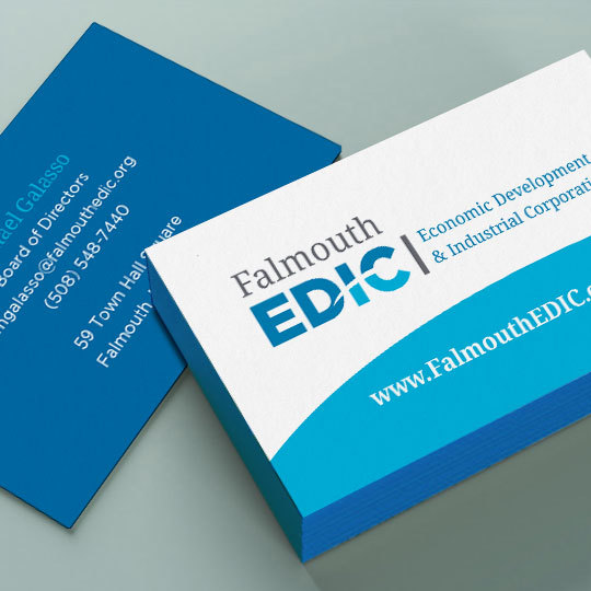
FALMOUTH EDIC (Falmouth Economic Industrial Corporation) is the Town of Falmouth’s primary agency responsible for creating and developing increased economic opportunities for both the present and the future. Over the years of the corporation's existence, their efforts had become less recognized in the community.
We assessed their existing brand identity and website, and discovered a dated "look and feel" and aging technology that affected how the organization was being perceived. We replaced their existing typographic mark with a more bold acronym, using a color palette mixed with navy and bright blues to suggest an agency with strength, professionalism and forward thinking abilities. The arc running through the letterforms is a subtle nod to the coastal location of the town that it serves. We also redesigned the website on an easy-to-update CMS platform that enables them to regularly publish information and news about their active projects and accomplishments in the community.
Brand Identity , Stationery & Business Forms , Website Design & User Interface , Signage , Marketing Collateral
View Project
Developing the Brand Essentials
Successfully Monetizing Your Wealth
SAYBROOK CAPITAL ADVISORS is a boutique merger & acquisition advisory firm focused on middle market businesses – manufacturing, business services, information technology and consumer goods – throughout the United States. They have deep experience in representing owners with the sale of their business, merger, recapitalization, capital sourcing and exit planning advisory needs.
As a new start-up by an owner with over 35 years of experience, it was important for the brand to convey professionalism, experience and integrity. The name was born out of the location of the business – Saybrook, CT – home to the 130+ year-old Saybrook Breakwater Light. It seemed a natural fit to incorporate a lighthouse into the brand identity to represent the company as a beacon of trustworthy guidance to help avoid dangerous situations. The stylized "S" stripe further customizes the mark. The combination of serif and san-serif typography suggests the forward thinking ability along with the strength, stability and experience that the advisors have to offer. The color palette complements the seaside location of the office and helps reinforce the company's gold standard of service that it provides on every transaction.
Brand Identity , Stationery & Business Forms , Website Design & User Interface , Marketing & Sales Collateral , Email Marketing Templates
View Project
Branding a One-of-a-Kind Restaurant
The Mediterranean Comes to Mashpee
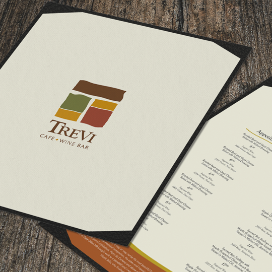
TREVI CAFÉ + WINE BAR is a small restaurant located in Mashpee Commons on Cape Cod at the intersection of Market and Fountain Streets overlooking a huge fountain. The owner loved to travel and wanted to create a café with a contemporary ambiance and a dash of European romance that would serve a Mediterranean-style cuisine composed of the season’s freshest ingredients accompanied by the finest wines.
The owner not only wanted us to design the logo, but create the name for the restaurant. Through our research, we supported the owner's vision by basing the name on the world-famous Fontana di Trevi, a fountain in the Trevi district in Rome, Italy. We configured a "T" for Trevi out of a simple graphic pattern that represented flat stones often found in the public, open gathering piazzas throughout Europe. The brand colors are fresh yet earthy and stem from a warm Tuscan palette referencing the colors often found in Italy's natural landscapes.
Naming , Brand Identity , Signage , Stationery , Menu
View Project