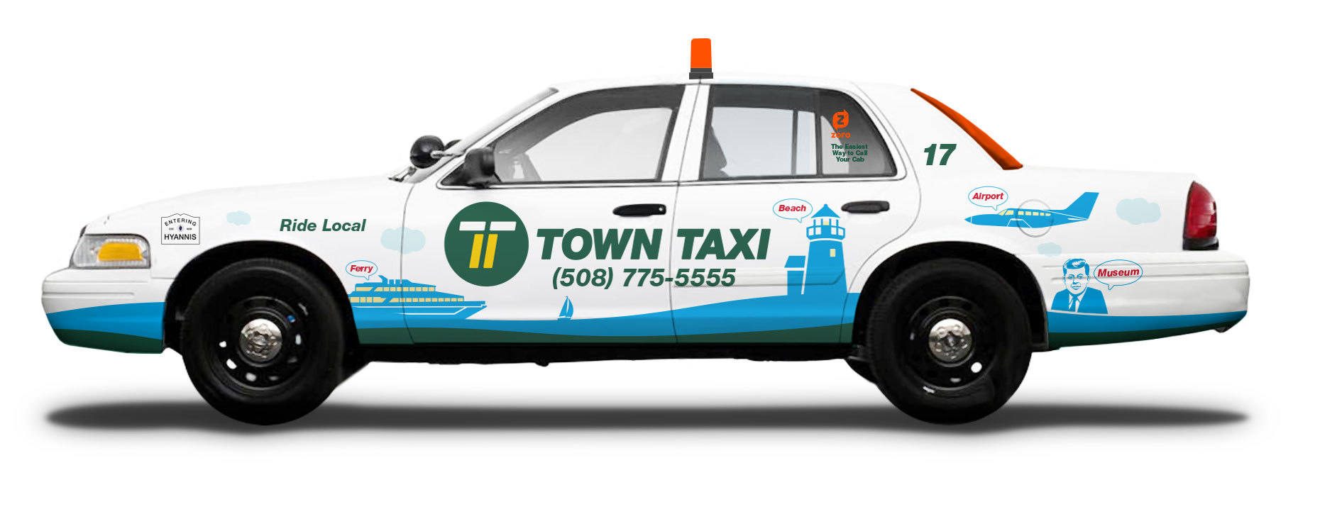
Town Taxi of Cape Cod
Revolutionary Rebrand for 24-Hour Transportation and Delivery Service
Rebranding for Industry Change
Always Open
TOWN TAXI OF CAPE COD has been serving the Cape's transportation and delivery needs since 1974 with reliable, professional drivers 24/7. When ridesharing companies emerged touting services that arrange one-time shared rides on very short notice, often via a mobile app, Town Taxi turned to Carol McLeod Design to rebrand themselves in an effort to maintain its foothold in the community and its perception as a more dependable and safe service.
Our approach to the rebrand was revolutionary in that we departed from the existing illustrated cartoon image of a taxi to a more sophisticated yet easily recognizable letterform. We merged two "Ts" – one for Town and one for Taxi – whereby the unity produced a double line. Colorizing this double line as yellow referenced the symbolic road marking that signifies a virtual "wall" to drivers – a no-passing zone – that reinforces the protective, trustworthy nature that Town Taxi drivers provide to their customers.


