Inventive Solutions for Exhibitions & Conferences
Featuring Hydroid at Oceanology International
Flexible. Multifunctional. Reusable.
Attracting Visitors to Hydroid
Oceanology International 2020 will be the third time that Carol McLeod Design has worked with Hydroid to concept, design, and manage the fabrication and installation of their stand at the world's largest ocean technology exhibition and conference. Every two years for the past 50 years, Oceanology International has been bringing together businesses, academic institutions, and government agencies from around the world to exhibit and share their products and expertise.
Hydroid's focus is on its ever-expanding line of autonomous underwater vehicles (AUVs) and supporting technology. To attract visitors, Carol McLeod Design has created environments unique to each event to showcase their products, capabilities and expertise.

Oceanology International 2016
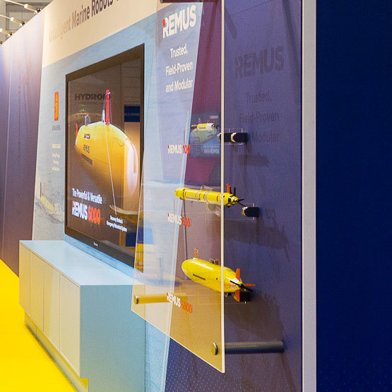
Since we had redesigned the REMUS product logo in 2013 as well as Hydroid's company logo in 2014, we designed their exhibit stand for Oceanology International 2016 to focus on Hydroid's new brand identity, emphasizing the common physical aspect of its products – the red fin. We wanted the booth to exude high quality and provide streamlined methods for displaying model vehicles and visual content. Design and construction of a 12-foot high red curved fin structure commanded attention from across the exhibit hall and enabled us to feature a new product on the front-facing side and create a discreet literature holder on the side edge. Together with bright yellow carpet flooring, the stand simulated the top surface of an AUV with the red fin protruding upwards. Scale model vehicles were mounted to the back wall and protected by an acrylic stand-off panel. The angles of the various graphic and physical components throughout the stand carried forth the structural element of the fin.

Oceanology International 2018
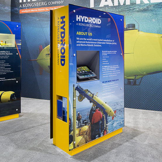
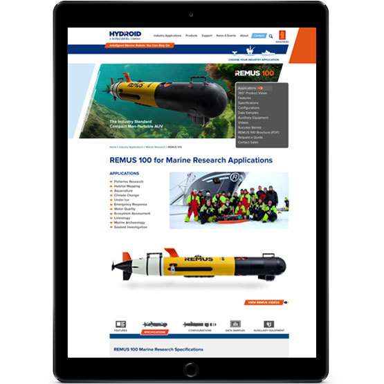
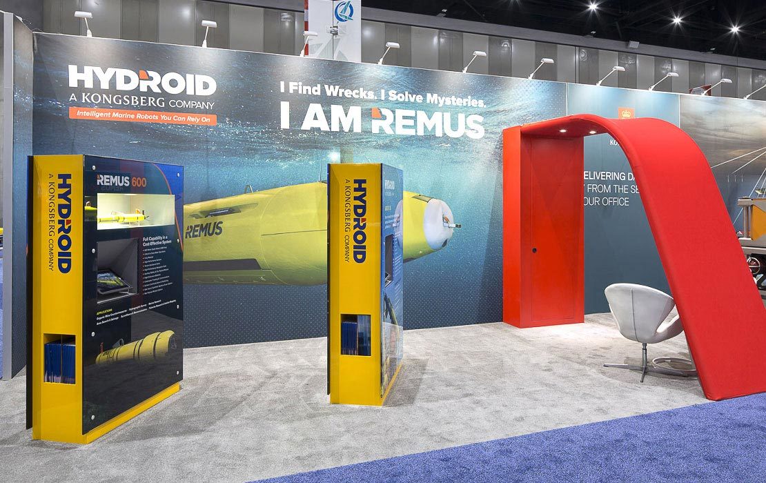
For Oceanology International 2018, the project requirements included incorporating: the red fin element; a semi-private meeting area; life-size model displays and scale model displays; interactive informational screens; and ample storage. We transformed the 10m x 5m space into a gallery-style setting with two custom-designed interactive kiosks to attract, engage and inform visitors. To keep with the streamline, high-quality look and feel of Hydroid's brand, we designed these furniture-grade kiosks for flexibility of messaging and for multifunctional use. Acrylic panels were designed to be interchanged from show to show as required to display messaging and vehicles relative to the audience. The core of each kiosk was skinned with yellow laminate to match the color of Hydroid's vehicles and powered to light displays and charge iPads.
Kiosk features include:
- Lighted display of up to two scale model vehicles when needed
- iPad mounted to angled charging station to display relevant product information
- Replaceable stand-off acrylic panels
- Discreet literature holder
- Secret storage compartment for give-aways
- Branded sides
We also designed and constructed a large fabric-covered frame to simulate the red fin element. It provided a locked storage cabinet and a casual meeting area tucked within it.
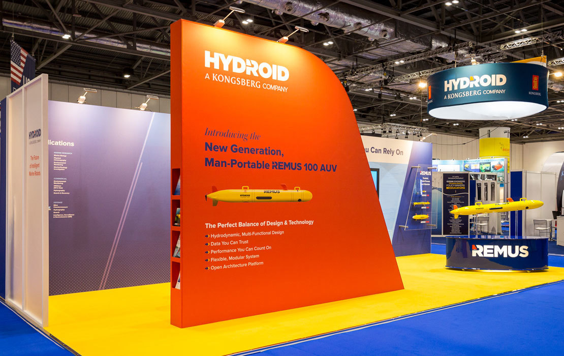
These components continue to be reconfigured and reused at other shows such as Oceanology North America and Sea Air Space.