Why Orange M
An Insight from Carol McLeod
Clear. Symbolic. Simple.
What's in a Name?

Way back when we built our first website, we bought the URL carolmcleoddesign.com. Seemed natural, right? That is the name of the company. But over time, we learned that it was difficult to convey the spelling audibly. People would call back asking if we received their email or say that they couldn’t find us online. We soon found out why. Our customers became quite creative on their own...spelling carol either with an ‘e’ or as carroll; mcleod as mccloud; and they almost always added an ‘s’ to design.
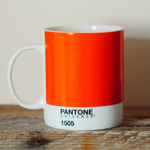
So why not eliminate the confusion and state the obvious? Our logo was an orange circle containing an "M" that stands for McLeod as well as for Methods. Madness. Momentum. I love the symbolic nature of orange. My favorite color. My favorite fruit. Memories of my first cat Polly and my big fat orange Crayola® crayon from first grade. There is only one way to spell it. Nothing rhymes with it so it is truly unique.
Unique...as is the approach Carol McLeod Design takes to solve each client's individual needs. And there you have it – orangem.com was born.